How to Create a Waterfall Chart in Excel (Complete Guide)
Step-by-step instructions for building waterfall charts in Excel 2016+ and older versions. Includes formatting tips, templates, and common mistakes to avoid.
A waterfall chart is a data visualization that shows how an initial value changes through a series of positive and negative adjustments to reach a final value. The bars appear to float, creating a visual "waterfall" effect where each step builds on the previous one.
McKinsey & Company popularized this chart type in their consulting presentations, which is why you'll also hear it called a bridge chart or McKinsey chart. The format works because it forces accountability: every change between start and end has a name and a size.
This guide covers both methods for building waterfall charts in Excel: the native chart type available in Excel 2016 and later, and the stacked column workaround for older versions.
When to Use a Waterfall Chart
Waterfall charts work best when you need to show how components add up to or subtract from a total. According to Microsoft's documentation on waterfall charts, they're particularly useful for understanding cumulative effects of sequential positive and negative values.
Common use cases:
| Use Case | Starting Point | Adjustments | Ending Point |
|---|---|---|---|
| Profit & Loss | Revenue | Costs, expenses, taxes | Net Income |
| Budget Variance | Budgeted Amount | Line item variances | Actual Amount |
| Revenue Bridge | Prior Year Revenue | Price, volume, mix changes | Current Year Revenue |
| Cash Flow | Opening Balance | Inflows and outflows | Closing Balance |
| Price Waterfall | List Price | Discounts, rebates, costs | Pocket Price |
Inforiver's analysis of waterfall charts in finance notes that "the main win is accountability: every step has a name and a size. That makes reviews faster and calmer, because the conversation starts with drivers instead of theories."
For pricing specifically, waterfall charts show how list price erodes to pocket price through discounts, rebates, freight costs, and other deductions. Our guide to price waterfall analysis covers this application in depth.
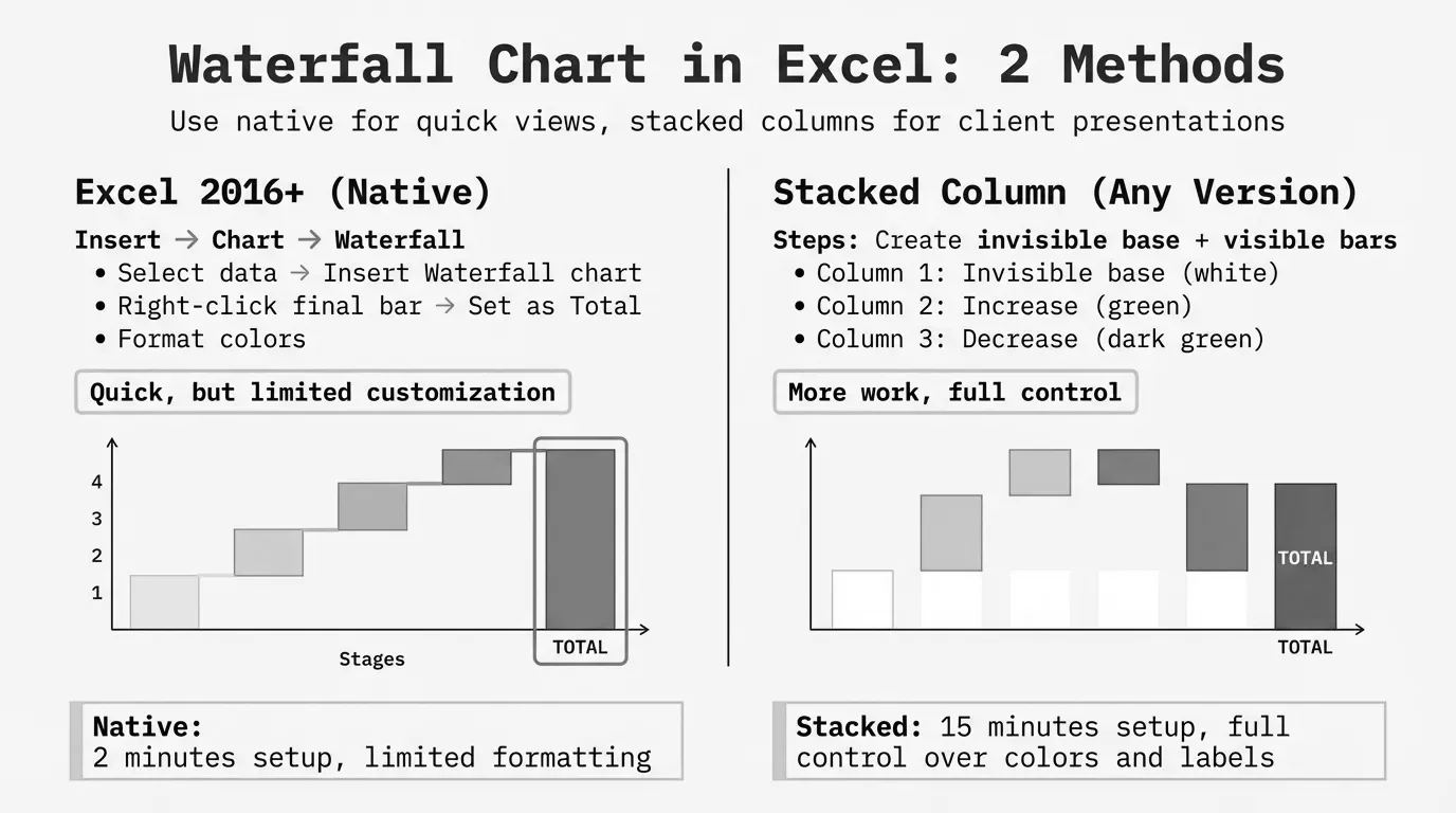
Creating a Waterfall Chart in Excel 2016+
Excel 2016 introduced native waterfall charts. If you're running Excel 2016, 2019, 2021, 2024, or Microsoft 365, this method takes about two minutes.
Step 1: Set Up Your Data
Create a two-column table with categories and values. Use positive numbers for increases and negative numbers for decreases.
| Category | Value |
|---|---|
| Starting Revenue | 500000 |
| Price Increase | 25000 |
| Volume Growth | 45000 |
| Lost Customer | -30000 |
| Currency Impact | -15000 |
| New Product | 35000 |
| Ending Revenue | 560000 |
The starting and ending rows contain the actual totals. Everything in between represents changes.
Step 2: Insert the Waterfall Chart
- Select your data range (both columns, including headers)
- Go to Insert tab
- Find the Waterfall button in the Charts group (it's labeled "Waterfall or Stock Chart" when you hover)
- Click the first option: Waterfall
Excel inserts a basic waterfall chart onto your worksheet.
Step 3: Set Total Bars
This step trips up most people. Excel doesn't automatically recognize that "Starting Revenue" and "Ending Revenue" are totals that should anchor to the baseline.
To fix this:
- Click once on the Starting Revenue bar (the entire series will highlight)
- Click a second time on just the Starting Revenue bar (only that bar highlights)
- Right-click and select Set as Total
- Repeat for the Ending Revenue bar
Total bars now anchor to the horizontal axis at zero instead of floating.
Step 4: Format the Chart
Colors: By default, Excel uses green for increases, red for decreases, and gray for totals. To change colors:
- Click any bar in a category (e.g., any increase bar)
- Right-click > Format Data Series
- Under Fill, choose your color
The standard convention is green for positive, red for negative. Stick with it unless your organization uses different standards.
Connector lines: These thin lines connecting bars are on by default. If they're missing:
- Click the chart
- Look for the Chart Elements button (+) at the top right
- Check "Connector Lines" or find the option in Format Data Series
Data labels: Right-click any bar > Add Data Labels. Position them inside or outside the bars based on readability.
Creating a Waterfall Chart in Older Excel Versions
For Excel 2013 and earlier, you'll build a waterfall using a stacked column chart with a hidden "base" series. Peltier Tech's waterfall chart documentation describes this as "a stacked column chart with the bottom column in the stack hidden to make the others float."
This method also works if you need more control over formatting than the native chart provides.
Step 1: Build the Calculation Table
You need four columns: Category, Base, Fall (decreases), and Rise (increases).
| Category | Base | Fall | Rise |
|---|---|---|---|
| Starting Revenue | 0 | 0 | 500000 |
| Price Increase | 500000 | 0 | 25000 |
| Volume Growth | 525000 | 0 | 45000 |
| Lost Customer | 540000 | 30000 | 0 |
| Currency Impact | 510000 | 15000 | 0 |
| New Product | 495000 | 0 | 35000 |
| Ending Revenue | 0 | 0 | 560000 |
How the Base column works:
The Base creates an invisible pedestal that positions each bar at the correct height.
- For the first bar (Starting Revenue): Base = 0
- For increases: Base = previous Base + previous Rise
- For decreases: Base = previous Base + previous Rise - current Fall
- For the final bar (Ending Revenue): Base = 0
The Base column essentially tracks the running total at each step.
Step 2: Create the Stacked Column Chart
- Select all four columns (Category through Rise)
- Go to Insert > Column Chart > Stacked Column
- Excel creates a stacked bar with three visible series: Base, Fall, and Rise
Step 3: Hide the Base Series
- Click any bar in the Base series (the bottom segments)
- Right-click > Format Data Series
- Under Fill, select "No fill"
- Under Border, select "No line"
The Base series becomes invisible. The Fall and Rise bars now appear to float at the correct heights.
Step 4: Clean Up
Remove Base from legend:
- Click the legend
- Click specifically on the "Base" entry
- Press Delete
Color the series:
- Click any Fall bar > Format > Fill with red
- Click any Rise bar > Format > Fill with green
Add data labels: Right-click each series > Add Data Labels
Adding Connector Lines (Manual Method)
The stacked column method doesn't include connector lines automatically. You have three options:
- Skip them. Many waterfall charts work fine without connectors.
- Add as shapes. Insert > Shapes > Line, then manually draw lines between bars. Tedious for many categories.
- Use error bars. More complex but creates dynamic connectors. This requires additional helper columns.
For most business applications, skipping connector lines is acceptable.
Formatting Best Practices
Color Conventions
Most financial waterfalls follow this pattern:
| Element | Color | Reasoning |
|---|---|---|
| Increases | Green | Positive = good |
| Decreases | Red | Negative = attention |
| Totals | Blue or gray | Neutral, anchored |
| Subtotals | Lighter blue | Intermediate checkpoints |
Storytelling with Charts' waterfall guide recommends formatting subtotal bars differently: "a clear color or pattern, and you could adjust the width to make them a little wider."
Avoid using too many colors. Three is usually enough.
Axis Scaling
When creating multiple waterfall charts for comparison (e.g., Q1 vs Q2, or Division A vs Division B), manually set consistent axis scales:
- Right-click the vertical axis
- Select Format Axis
- Under Bounds, set fixed Minimum and Maximum values
Without this, a $1M change might look larger than a $5M change if Excel auto-scales each chart differently.
Handling Negative Values
If your waterfall starts below zero or includes large negative swings, the native Excel waterfall handles this automatically. The stacked column method requires more complex formulas to calculate correct base values for negative ranges.
Labels and Readability
With many categories, labels can overlap or become unreadable. Solutions:
- Rotate labels: Right-click axis > Format Axis > Alignment
- Abbreviate: Use "Q1" instead of "First Quarter 2024"
- Group small items: Combine minor adjustments into an "Other" category
- Use two rows: If your categories are long, split into two lines
Zebrabi's waterfall chart analysis notes a common problem: "contributions are often very small compared to totals. While the chart correctly visualizes the situation, this can make the chart difficult to read." In these cases, consider a separate detailed view for small items.
Common Mistakes and Fixes
Problem: Totals Are Floating
Symptom: Your starting or ending value shows as a floating bar instead of anchoring to zero.
Fix: Click the bar twice to select just that data point (not the whole series), then right-click > Set as Total.
Problem: Can't Find "Set as Total" Option
Symptom: Right-clicking doesn't show the Set as Total option.
Fix: You've selected the entire series, not a single bar. Click once on the chart, then click a second time specifically on the bar you want to set as a total. The option appears only when a single data point is selected.
Problem: Connector Lines Are Diagonal
Symptom: The connector lines between bars aren't horizontal.
Fix: Your values don't actually connect. If Bar A ends at 500 and Bar B starts at 480, the connector will slope. Check your data: each bar should start exactly where the previous bar ended.
Problem: Chart Is Too Cluttered
Symptom: Too many small adjustments make the chart unreadable.
Fix: Group minor items. Instead of showing 15 small cost categories, show "Materials," "Labor," "Overhead," and "Other." Detailed breakdowns can go in a separate chart or table.
Problem: Colors Don't Match My Company Template
Symptom: You need specific brand colors, not Excel's defaults.
Fix: Format each data series individually. Click the series > Format Data Series > Fill > select Solid Fill > choose your exact color. For RGB values, select "More Colors" > Custom.
Problem: Chart Won't Work in Older Excel
Symptom: Someone with Excel 2013 or earlier can't open your file or sees errors.
Fix: If sharing with older Excel users, use the stacked column method instead. Native waterfall charts added in Excel 2016 cause compatibility issues with earlier versions.
Waterfall Charts for Pricing Analysis
Price waterfall analysis uses this chart format to show margin leakage from list price to pocket price. The visualization makes it obvious where money disappears.
Example price waterfall data:
| Category | Value |
|---|---|
| List Price | 100 |
| Invoice Discounts | -15 |
| Off-Invoice Rebates | -5 |
| Freight Allowance | -3 |
| Payment Terms | -2 |
| Co-op/Marketing | -4 |
| Pocket Price | 71 |
That $100 list price becomes $71 in pocket price, a 29% erosion that won't show up on any invoice. Each bar quantifies a specific leakage point.
According to PriceFX's pricing waterfall overview, these off-invoice deductions average up to 33% of list price for B2B companies. The waterfall chart makes these hidden costs visible.
For a detailed walkthrough of price waterfall analysis, including formulas and templates, see our guide to building price waterfalls in Excel.
Waterfall Chart Templates
If you'd rather start with a template than build from scratch:
Microsoft's official templates: Search "waterfall" in Excel's template gallery (File > New > search). Microsoft provides basic financial waterfall templates that work with Excel 2016+.
Manual method templates: For the stacked column approach, download Peltier Tech's waterfall chart utility, which automates the base calculations and hidden series setup.
What to look for in templates:
- Clear documentation of how to modify data ranges
- Formulas that update automatically when you add/remove categories
- Consistent color scheme that matches your needs
- Compatibility with your Excel version
For price waterfall templates specifically, see our price waterfall template resource.
When Excel Isn't Enough
Excel handles waterfall charts for straightforward scenarios. The limitations show up when:
- You need multiple dimensions. Showing waterfalls by customer segment, product category, and time period simultaneously overwhelms Excel.
- Data updates frequently. Manual refresh becomes a bottleneck when you need weekly or daily waterfalls.
- You're comparing many waterfalls. Side-by-side comparison of 10+ waterfalls requires consistent formatting that's tedious to maintain.
- You need drill-down. Excel waterfalls are static. Clicking a bar to see underlying transactions requires separate analysis.
For basic monthly or quarterly reporting, Excel works fine. For operational pricing analysis where you need to investigate specific transactions, dedicated tools save time.
Next Steps
To build your first waterfall chart:
- Identify what you want to visualize (budget variance, revenue bridge, price waterfall)
- Organize data as categories and values
- Use the native waterfall chart (Excel 2016+) or stacked column method (older versions)
- Set total bars so they anchor to the baseline
- Apply consistent colors: green for increases, red for decreases
- Check that connector lines are horizontal (data connects properly)
For price waterfall analysis specifically, our price waterfall analysis guide covers the methodology, and our price waterfall Excel tutorial provides step-by-step formulas.
Last updated: January 28, 2026
Frequently Asked Questions
Want to analyze your entire product catalog?
Pryse automatically identifies margin leakage across thousands of SKUs. Upload your data and find hidden profit in 24 hours.
One-time $1,499 diagnostic. No subscription required.