Price Waterfall Chart: How to Read and Create Effective Visualizations
Learn how to read price waterfall charts, interpret each bar, and create visualizations that reveal margin leakage from list price to pocket price.
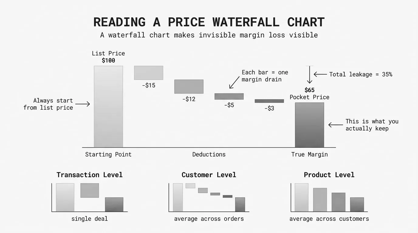
A price waterfall chart is a visualization showing how list price erodes to pocket price through sequential deductions, with each bar representing a discount, rebate, or cost that reduces the amount collected from a transaction.
The format originated in McKinsey's pricing research in the 1990s. Their analysis of a lighting manufacturer found invoice prices 32.8% below list, with off-invoice deductions adding another 16.3 points. Pocket price was half of list price, and nobody had seen it until they drew the waterfall.
The chart works because it turns abstract margin loss into something you can point at. A table with 47 discount line items is unreadable. A waterfall showing seven erosion factors tells you exactly where to focus.
How to Read a Price Waterfall Chart
A waterfall chart flows left to right. The first bar anchors to the baseline (usually zero). Each subsequent bar floats, starting where the previous one ended. This creates the cascading "waterfall" effect.
The Three Types of Bars
| Bar Type | What It Shows | Visual Treatment |
|---|---|---|
| Starting total | List price or beginning value | Anchored to baseline, neutral color |
| Changes | Each discount, rebate, or cost | Floating, color-coded by direction |
| Ending total | Pocket price or final value | Anchored to baseline, neutral color |
Starting total: The leftmost bar shows list price. The bar starts at zero and rises to the full amount.
Changes: The middle bars show decreases (discounts and costs). Each bar starts where the previous bar ended and drops by the deduction amount.
Ending total: The rightmost bar shows pocket price or pocket margin. It anchors back to the baseline to show the final position.
Reading the Flow
Start at the left. The list price bar establishes the starting point. Then follow the deductions:
- On-invoice discounts (standard discount, volume discount, promotional pricing)
- Invoice price subtotal (optional checkpoint)
- Off-invoice deductions (rebates, freight, payment terms)
- Pocket price (what you actually collected)
The vertical distance from list price to pocket price represents total erosion. A 40% erosion means the pocket price bar reaches only 60% of the list price bar height.
What the Colors Mean
- Red bars = Decreases (discounts, rebates, costs)
- Green or blue bars = Increases (rare in price waterfalls)
- Gray or dark blue bars = Totals (starting and ending points)
Some waterfalls use light red for on-invoice and dark red for off-invoice deductions. This distinction matters because on-invoice erosion is visible in your ERP. Off-invoice erosion is the hidden layer that McKinsey found averages 16.3% of list price.
Key Visual Elements
The difference between a waterfall chart that communicates and one that confuses comes down to five elements.
Connector lines link each bar to the next, showing the running total as values change. Without connectors, floating bars look disconnected. Good charting tools add these automatically.
Data labels on each column help readers compare values. Data visualization research confirms labels are necessary because waterfall bars don't share a common baseline.
Subtotals act like chapter breaks. A price waterfall benefits from at least one subtotal: invoice price.
List Price - On-Invoice Discounts = Invoice Price (subtotal)
Invoice Price - Off-Invoice Deductions = Pocket Price (final)
Category limits matter. Visualization best practice recommends 10-15 bars maximum. More bars create a jagged staircase. Group small factors into "Other" categories.
Consistent scale starting at zero ensures accurate visual representation. If pocket price is 65% of list, that bar should appear at 65% of the height.
Healthy vs. Unhealthy Waterfalls
The shape of a price waterfall chart tells you whether pricing is under control.
Healthy Waterfall Characteristics
| Characteristic | What It Looks Like |
|---|---|
| Moderate total erosion | Final bar at 65%+ of starting bar height |
| Balanced deductions | No single bar dominates the middle section |
| Thin off-invoice layer | Off-invoice bars combined shorter than largest on-invoice bar |
| Clean progression | Smooth staircase, not jagged peaks |
Unhealthy Warning Signs
| Warning Sign | What It Looks Like |
|---|---|
| Excessive erosion | Final bar below 55% of starting bar height |
| Dominant deduction | One bar accounts for 40%+ of total erosion |
| Hidden off-invoice layer | Off-invoice section larger than on-invoice |
| Jagged profile | Multiple small bars create staircase effect |
Comparison Example
Healthy Waterfall ($65M Manufacturer)
| Step | Amount | Running Total |
|---|---|---|
| List Price | $1,000 | $1,000 |
| Standard Discount | -$150 | $850 |
| Volume Discount | -$51 | $799 |
| Rebates | -$32 | $767 |
| Freight | -$24 | $743 |
| Other Off-Invoice | -$15 | $728 |
| Pocket Price | — | $728 |
Total erosion: 27.2%. Pocket price is 72.8% of list.
Problematic Waterfall ($55M Distributor)
| Step | Amount | Running Total |
|---|---|---|
| List Price | $1,000 | $1,000 |
| Standard Discount | -$250 | $750 |
| Strategic Account | -$75 | $675 |
| Project Bid | -$61 | $614 |
| Promotional | -$37 | $577 |
| Annual Rebate | -$35 | $542 |
| Freight | -$29 | $513 |
| Co-op/Other | -$68 | $445 |
| Pocket Price | — | $445 |
Total erosion: 55.5%. Pocket price is 44.5% of list.
The healthy waterfall descends gradually. The problematic waterfall drops sharply through multiple overlapping discount programs.
Best Practices
Design
Keep it simple. Remove gridlines, legends, and axis labels that don't add information.
Emphasize endpoints. Make starting and ending bars visually distinct. Think-cell research shows distinctive endpoints help audiences understand the narrative faster.
Order bars logically. Follow the actual sequence: on-invoice discounts first, then off-invoice deductions. Within sections, order by size.
Use consistent colors. Red for all deductions, neutral for totals. Multiple colors create cognitive load without adding insight.
Analysis
Build multiple waterfalls for top customers, segments, products, and sales reps. A company-wide average hides variation.
Compare over time. A quarterly series shows whether pricing discipline improves or erodes.
Calculate pocket margin, not just pocket price. $728 pocket price means nothing without COGS.
Pocket Margin = (Pocket Price - COGS) / Pocket Price x 100Presentation
Lead with the punchline. "Our pocket margin is 17%, not 28%" is more compelling than walking through every deduction.
Quantify in dollars. "We're leaving $4.2M on the table annually" is concrete. Percentages are abstract.
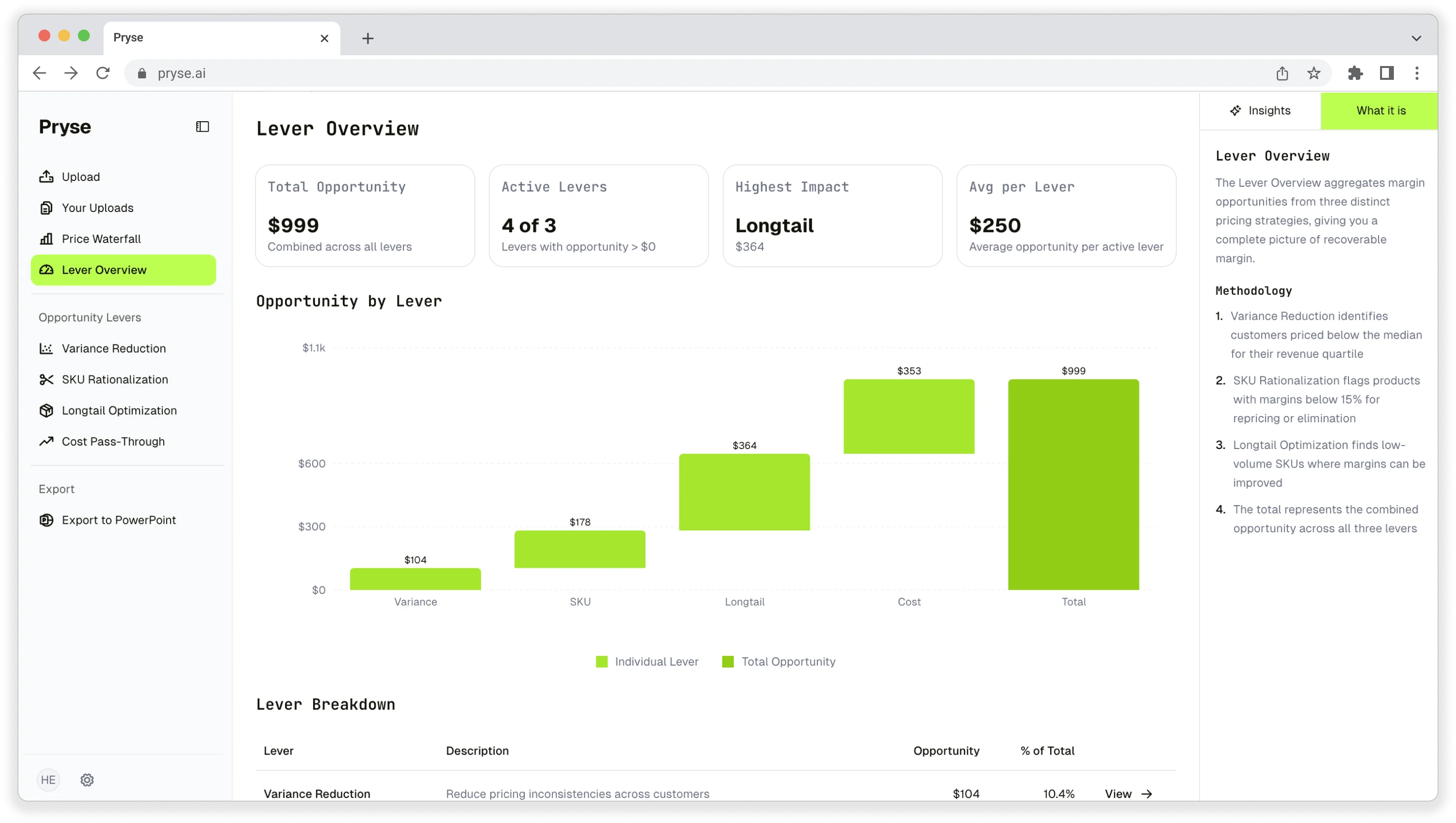
Tools for Creating Price Waterfall Charts
Excel
Excel 2016 and later includes native waterfall support: Insert > Charts > Waterfall. Click any bar and select "Set as Total" to anchor it.
Best for: Initial analysis, small datasets under 5,000 SKUs. See our guide on building price waterfalls in Excel.
Power BI
Power BI's waterfall visual adds total bars automatically and handles variance calculations.
Best for: Recurring analysis connected to live data sources.
Tableau
Tableau creates waterfalls using running total table calculations.
Best for: Complex analysis embedded in larger analytical workflows.
Common Mistakes
Too many bars. A 30-bar waterfall is unreadable. Group small factors—combine rebate types into "Rebates," payment costs into "Payment Terms."
Missing off-invoice deductions. A waterfall stopping at invoice price misses the point. The hidden 16% in off-invoice deductions is where companies find recoverable margin.
Inconsistent baselines. Comparing waterfalls requires the same baseline. If one division uses MSRP and another uses pre-discounted "standard price," comparisons are meaningless.
Ignoring variation. McKinsey found pocket prices ranging from 30% to 90% of list at one company. Build waterfalls for highest and lowest margin customers to see pricing variation.
From Chart to Action
A price waterfall chart is a diagnostic tool. The value comes from what you do with it.
-
Identify the largest bars. Which deductions cause the most erosion? Focus there.
-
Separate controllable from fixed. Channel discounts may be market-driven. Freight policies are your choice.
-
Quantify the opportunity. If freight absorption is 3.2% on $50M revenue, that's $1.6M annually.
-
Set targets. What should each bar look like in 12 months? Track progress.
-
Segment and repeat. Build waterfalls for accounts where you suspect margin issues.
For the complete methodology on analyzing price waterfalls, see our guide to price waterfall analysis.
Last updated: January 28, 2026
Frequently Asked Questions
Want to analyze your entire product catalog?
Pryse automatically identifies margin leakage across thousands of SKUs. Upload your data and find hidden profit in 24 hours.
One-time $1,499 diagnostic. No subscription required.