How to Build a Price Waterfall in Excel (Step-by-Step)
Build a price waterfall chart in Excel to visualize margin leakage from list price to pocket price. Includes formulas, data setup, and formatting.
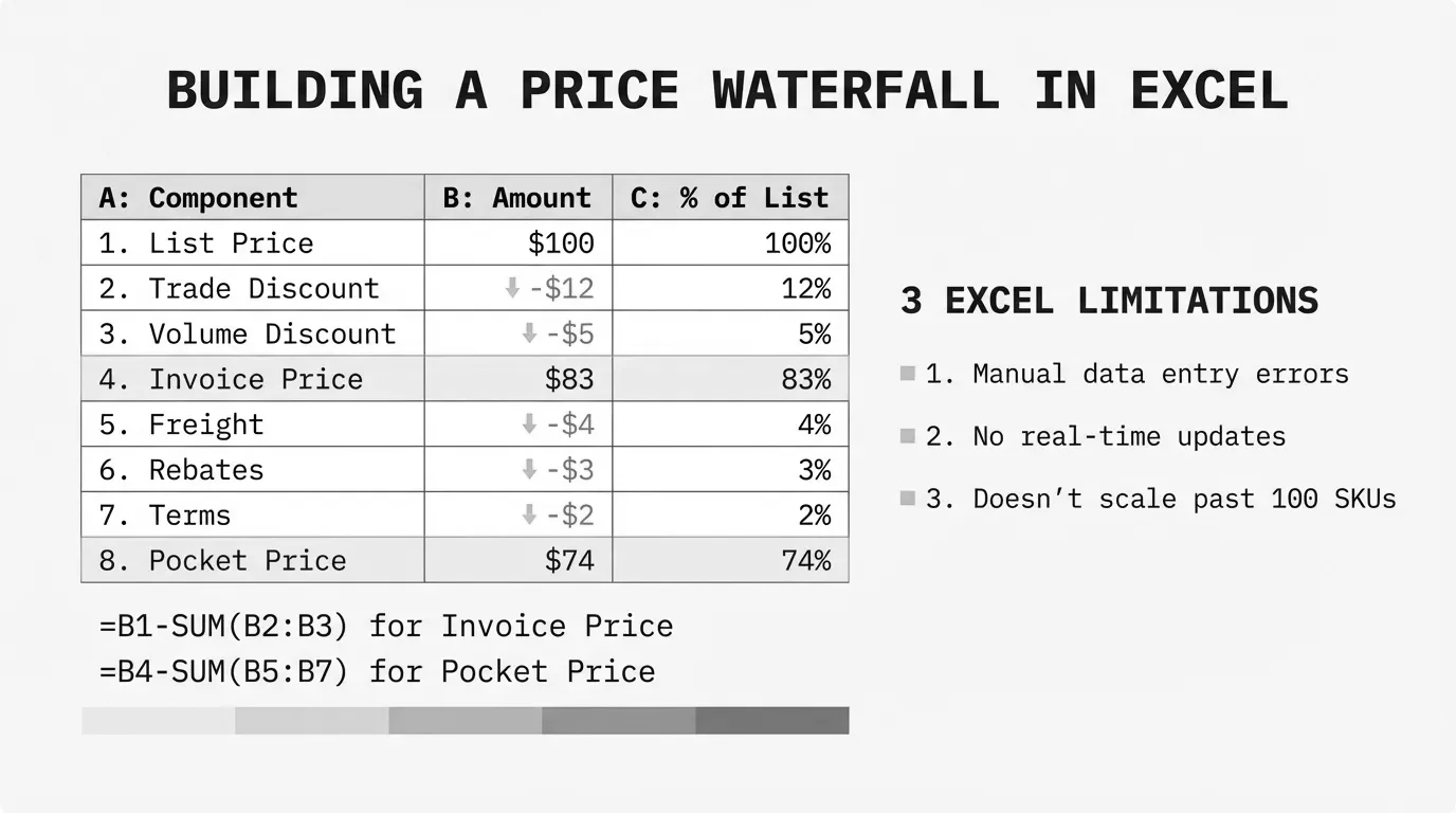
A price waterfall is a visualization that shows exactly where your margin disappears between the price you quote and the money you actually keep. McKinsey coined the term "pocket price" to describe this final number—what ends up in your pocket after every discount, rebate, and cost comes out.
Most mid-market distribution and manufacturing companies build their first price waterfalls in Excel. The spreadsheet is already there. Everyone knows how to use it. And for a first pass at understanding margin leakage, it works.
This guide walks through building a price waterfall in Excel from scratch: the data structure you need, the chart mechanics, the formulas, and the honest limitations you'll hit as transaction volume grows.
Why Excel for Price Waterfalls
Excel remains the default tool for price waterfall analysis at companies between $20M and $200M in revenue. The reasons are practical:
- Zero implementation cost. You already have Excel.
- Immediate access. No procurement process, no IT tickets, no vendor calls.
- Familiar interface. Your team knows pivot tables and formulas.
- Good enough for discovery. Finding that margin leakage exists matters more than perfect visualization.
According to Canidium's analysis of pricing software ROI, Excel handles pricing analysis adequately for smaller operations. The problems emerge at scale—but you need to see the problem first before you can justify solving it.
For a complete breakdown of price waterfall methodology beyond what we'll cover here, see our guide to price waterfall analysis.
The Data Structure You Need
A price waterfall requires transaction-level data with enough detail to calculate each step from list price to pocket price. Here's the minimum structure:
| Column | Header | Description |
|---|---|---|
| A | Transaction ID | Unique identifier for each sale |
| B | Customer | Customer name or ID |
| C | Product | SKU or product name |
| D | List Price | Starting price before any deductions |
| E | Invoice Discount | On-invoice discounts (volume, promotional) |
| F | Invoice Price | What appears on the bill |
| G | Rebates | Off-invoice rebates and kickbacks |
| H | Freight Allowance | Shipping costs you absorb |
| I | Payment Terms Cost | Early payment discounts taken |
| J | Co-op/MDF | Marketing funds and allowances |
| K | Pocket Price | What you actually keep |
| L | Pocket Margin | Pocket price minus your cost |
The distinction between invoice price and pocket price matters. PriceFX's overview of pricing waterfalls notes that on average, these off-invoice leakages account for up to 33% of list price. Your invoice might show a 10% discount, but pocket price can be 25% below list once all the costs come through.
Sample Data Setup
Here's how your data might look for a single transaction:
| Field | Value |
|---|---|
| List Price | $100.00 |
| Invoice Discount | -$15.00 |
| Invoice Price | $85.00 |
| Rebates | -$5.00 |
| Freight Allowance | -$3.00 |
| Payment Terms | -$2.00 |
| Co-op/MDF | -$4.00 |
| Pocket Price | $71.00 |
That $100 list price becomes $71 in your pocket—a 29% erosion that might not be visible without waterfall analysis.
Calculating Each Waterfall Element
Before building the chart, set up formulas for each waterfall step.
Invoice Price Calculation
= List_Price - Invoice_DiscountWith your data in columns D and E:
= D2 - E2Pocket Price Calculation
= Invoice_Price - Rebates - Freight - Payment_Terms - CoOpOr in one formula from list price:
= D2 - E2 - G2 - H2 - I2 - J2Pocket Margin Calculation
You'll need a cost column (let's call it M) for this:
= K2 - M2Pocket Margin Percentage
= ( K2 - M2 ) / K2Wrap in IFERROR to handle zero-revenue rows:
= IFERROR( ( K2 - M2 ) / K2, 0 )Aggregating for the Waterfall Chart
Your waterfall chart needs summarized data, not transaction-level detail. Create a summary table that averages or sums your waterfall elements:
| Category | Amount |
|---|---|
| List Price | $100.00 |
| Invoice Discounts | -$15.00 |
| Rebates | -$5.00 |
| Freight | -$3.00 |
| Payment Terms | -$2.00 |
| Co-op/MDF | -$4.00 |
| Pocket Price | $71.00 |
For averaged data across many transactions, use AVERAGE or weighted average with SUMPRODUCT:
= SUMPRODUCT( Amount_Range, Revenue_Range ) / SUM( Revenue_Range )Building the Waterfall Chart in Excel 2016+
Excel 2016 introduced native waterfall charts. If you have a modern Excel version, this is the straightforward path.
Step 1: Prepare the Summary Data
Create a two-column table with categories and values. Positive values increase the bar; negative values decrease it.
| Category | Value |
|---|---|
| List Price | 100 |
| Invoice Discounts | -15 |
| Rebates | -5 |
| Freight | -3 |
| Payment Terms | -2 |
| Co-op/MDF | -4 |
| Pocket Price | 71 |
Step 2: Insert the Waterfall Chart
- Select your data range (both columns, including headers)
- Go to Insert > Charts > Waterfall
- Excel creates a basic waterfall chart
Step 3: Set Total Bars
Excel doesn't automatically know that "List Price" and "Pocket Price" are totals (anchored to the axis) rather than changes. To fix this:
- Click on the List Price bar
- Right-click and select "Set as Total"
- Repeat for the Pocket Price bar
Total bars anchor to the baseline instead of floating.
Step 4: Format for Readability
Click on any positive bar, right-click, choose Format Data Series:
- Set fill color to green for increases (if any)
Click on any negative bar:
- Set fill color to red for decreases
Click on total bars:
- Set fill color to blue or gray to distinguish from changes
Add data labels: Right-click the chart, Add Data Labels. Format to show values.
Building the Waterfall Chart in Older Excel (Stacked Bar Method)
For Excel 2013 and earlier, you'll build a waterfall using stacked column charts with a hidden "base" series. Peltier Tech's documentation describes this as "a stacked column chart with the bottom column in the stack hidden to make the others float."
Step 1: Create the Calculation Table
You need three columns: Base, Fall (negative changes), and Rise (positive changes).
| Category | Base | Fall | Rise |
|---|---|---|---|
| List Price | 0 | 0 | 100 |
| Invoice Discounts | 85 | 15 | 0 |
| Rebates | 80 | 5 | 0 |
| Freight | 77 | 3 | 0 |
| Payment Terms | 75 | 2 | 0 |
| Co-op/MDF | 71 | 4 | 0 |
| Pocket Price | 0 | 0 | 71 |
The Base column calculates the invisible "pedestal" that makes bars float at the right height.
Base Column Formulas
For the first row (List Price):
= 0For each subsequent row (e.g., Invoice Discounts):
= Previous_Base + Previous_Rise - Current_FallOr more simply, the base equals the running total after applying the change:
= Pocket_Price_At_This_StepStep 2: Create the Stacked Column Chart
- Select all four columns (Category, Base, Fall, Rise)
- Insert > Column Chart > Stacked Column
- Excel creates a stacked bar with three visible series
Step 3: Hide the Base Series
- Click on any Base series bar (the bottom segments)
- Right-click > Format Data Series
- Under Fill, select "No fill"
- Under Border, select "No line"
The base series becomes invisible, making the Fall and Rise bars appear to float.
Step 4: Remove Base from Legend
Right-click the legend, click on the Base entry, and delete it. Your legend should only show Fall and Rise (or whatever you've named them).
Step 5: Color and Format
- Color Fall bars red
- Color Rise bars green (or blue for totals)
- Add data labels
- Adjust axis scaling if needed
Common Formatting Issues
Connector Lines
Native Excel waterfall charts include connector lines between bars. The stacked bar method doesn't. If you want connectors with the manual method, you'll need to add them as shapes or lines—tedious for many categories.
Axis Scaling
When creating multiple waterfall charts for comparison, Excel auto-scales each axis independently. A $1M change might look larger than a $5M change if the axes differ. Manually set axis minimum and maximum values for consistency:
- Right-click the vertical axis
- Format Axis
- Set Bounds: Minimum and Maximum to fixed values
Negative Starting Values
If your waterfall includes negative values or starts below zero, the math for the stacked bar method becomes more complex. The native waterfall chart handles this automatically.
Analyzing Price Waterfall Results
Building the chart is step one. The analysis comes next.
Identify Your Largest Leakage Points
Look at which bars cause the biggest drops. Zilliant's analysis of margin leakage points out a common scenario: "Sales believes they have 'only' given a 10% discount. Finance sees that by the time all incentives, rebates, and services are added, pocket price is 25% below list."
The biggest bars in your waterfall represent the biggest opportunities.
Segment by Customer Type
Build separate waterfalls for different customer segments. Large customers often have deeper discounts, more rebates, and higher service costs. Quantifying the difference between segments reveals where margin actually goes.
Calculate the Dollar Opportunity
If your average invoice discount is 15% but should be 12%, the math is straightforward:
= Total_Revenue * ( Current_Discount% - Target_Discount% )A $50M distributor reducing invoice discounts by 3 percentage points recovers $1.5M annually.
Track Changes Over Time
Create monthly or quarterly waterfalls to spot trends. Discount creep—gradually deeper discounts over time—won't show in a single snapshot but becomes obvious when you line up waterfalls side by side.
Where Excel Breaks Down
Excel handles price waterfall analysis for straightforward scenarios. It fails in predictable ways as complexity increases.
Volume Limitations
SYMSON's analysis of Excel pricing limitations notes that Excel "struggles with complex calculations, resulting in many interlinked sheets, and human error increases as spreadsheets get more complicated."
Around 5,000 SKUs or 50,000 transactions, Excel becomes unwieldy. Pivot tables lag. Finding specific data requires constant filtering. The spreadsheet itself becomes a productivity problem.
Manual Data Aggregation
Price waterfall analysis requires clean, consolidated data. When that data lives in separate systems—ERP for transactions, CRM for customer segments, shipping system for freight costs—someone has to manually export, clean, and combine it. Every month. That person's time has a cost.
No Real-Time Analysis
Excel shows where you were, not where you are. If you need to see the margin impact of a proposed price change before approving it, or evaluate a new customer's waterfall profile before accepting their business, spreadsheets can't help.
Version Control Problems
Qashqade identifies six reasons to stop using Excel for waterfall calculations, including: "There's no audit history—you can't be sure nobody has changed anything since last time." When multiple people touch the same waterfall analysis, version chaos follows.
Multi-Dimensional Analysis
"What's our pocket margin on Category X products sold to Large customers in the Northeast during Q4?" These questions require slicing data across multiple dimensions simultaneously. Excel can technically answer them, but the time cost makes it impractical.
When to Move Beyond Excel
Excel works for initial discovery. You've found margin leakage exists. You've quantified some of the opportunity. Now what?
Stay with Excel if:
- You have fewer than 1,000 SKUs
- Data lives in one system
- You need quarterly analysis, not real-time
- One person owns the analysis
Consider dedicated tools if:
- You have 5,000+ SKUs
- Data comes from multiple systems
- You need real-time pricing decisions
- Multiple stakeholders need access
- You're spending more time maintaining the spreadsheet than acting on insights
The point of price waterfall analysis is finding money—not demonstrating Excel proficiency. When the spreadsheet becomes the obstacle instead of the tool, it's time for something built for this purpose.
Next Steps
If you're ready to build your first price waterfall in Excel:
- Export transaction data from your ERP with all discount and cost fields
- Set up the column structure described above
- Calculate pocket price for each transaction
- Aggregate into a summary table
- Build the waterfall chart using the native or stacked bar method
- Identify your top three leakage points
For companies that have outgrown Excel, Pryse automates price waterfall analysis from CSV upload. Upload your transaction data, get a complete waterfall visualization and margin leakage quantification within 24 hours—no implementation project required.
For the complete methodology behind price waterfall analysis, including advanced segmentation techniques and optimization strategies, see our guide to price waterfall analysis.
Last updated: January 28, 2026
Frequently Asked Questions
Want to analyze your entire product catalog?
Pryse automatically identifies margin leakage across thousands of SKUs. Upload your data and find hidden profit in 24 hours.
One-time $1,499 diagnostic. No subscription required.