Pricing Dashboard: Complete Guide for B2B Companies
Learn what a pricing dashboard is, which KPIs matter for distributors and manufacturers, and how to build one that actually improves pricing decisions.
A pricing dashboard is a visual display that consolidates key pricing performance indicators (KPIs) like margin realization, discount patterns, and revenue trends, enabling teams to monitor pricing health and make informed decisions without digging through spreadsheets or running manual reports.
According to research by McKinsey, companies that employ advanced analytics in their pricing strategies achieve 2-7% higher margins than competitors who don't use data-driven approaches. Pricing dashboards turn raw transaction data into actionable insights that teams can act on daily.
For mid-market distribution and manufacturing companies, pricing dashboards answer critical questions: Which customers get the deepest discounts? Which products are underpriced relative to costs? Where does margin leak across transactions? Are salespeople following pricing guidelines?
This post explains what pricing dashboards are, which KPIs matter for B2B companies, how to build effective dashboards, and when Excel suffices versus when specialized software makes sense.
What a Pricing Dashboard Actually Does
Pricing dashboards sit on top of your transaction data and visualize pricing performance in real-time or near-real-time, replacing manual analysis with automated tracking.
Core purposes:
- Monitor pricing health: Track whether pricing decisions align with strategy and deliver target margins
- Identify problems quickly: Surface margin leakage, excessive discounts, or pricing compliance issues before they compound
- Enable faster decisions: Provide instant visibility into pricing performance without waiting for month-end reports
- Align teams: Give sales, finance, and leadership shared visibility into pricing outcomes
- Track improvements: Measure impact of pricing changes and optimization initiatives
According to Pricen.ai's guide to pricing dashboards, pricing dashboards consolidate critical pricing information into visual, easy-to-interpret displays that enable quick decision-making. Companies that can spot pricing problems within days rather than months recover margin that would otherwise leak through entire quarters.
Pricing Dashboard vs. Sales Dashboard vs. Analytics Platform
These tools overlap but serve different purposes.
| Aspect | Pricing Dashboard | Sales Dashboard | Pricing Analytics Platform |
|---|---|---|---|
| Primary focus | Margin realization and pricing compliance | Volume, revenue, deal progression | Historical analysis and predictions |
| Key metrics | Pocket margin, discount depth, price realization | Revenue, quota attainment, pipeline | Price elasticity, customer segments |
| Primary users | Pricing managers, finance, executives | Sales reps, sales managers | Pricing analysts, strategists |
| Update frequency | Real-time to daily | Real-time | Daily to weekly |
| Action trigger | Discount exceeds threshold, margin drops | Deal stalls, quota gap opens | Quarterly price list updates |
In practice:
-
Pricing dashboard shows that Customer Segment A is getting 18% discounts on average (3 points above target) and Product Line B's pocket margin is 14.2% (down from 16.8% last quarter due to freight absorption).
-
Sales dashboard shows that Customer Segment A represents $4.2M in pipeline and is 45% of quota for the quarter, with 12 open deals averaging 28 days in sales cycle.
-
Pricing analytics platform recommends tightening discount approval thresholds for Customer Segment A by 2 points based on win rate analysis, and repricing Product Line B with 2-4% increases for customers where freight costs exceed 3% of order value.
Most companies need both dashboards and analytics. Dashboards provide daily monitoring. Analytics platforms drive strategic pricing decisions. See our pricing analytics software guide for detailed comparison of analytics platforms.
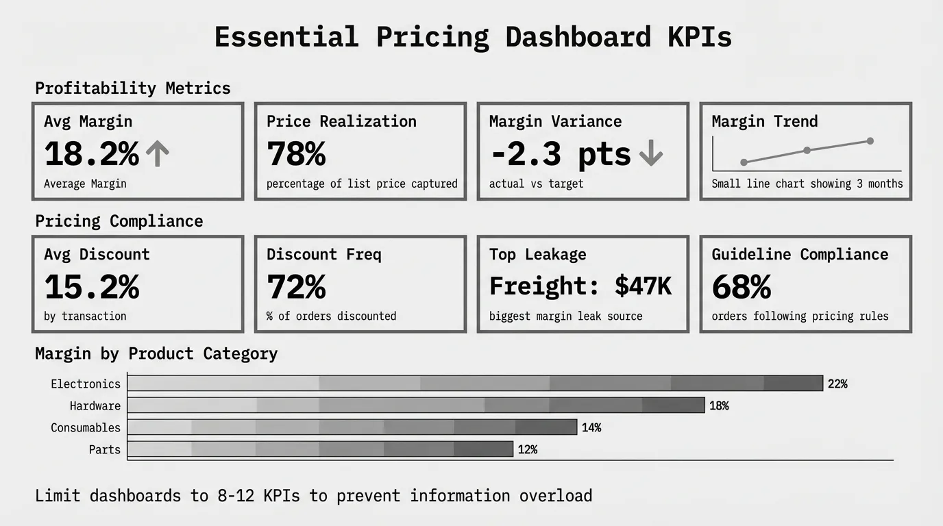
Essential Pricing KPIs for B2B Dashboards
Not every metric belongs on your pricing dashboard. According to Monetizely's research on pricing dashboard KPIs, the best pricing dashboards balance comprehensiveness with usability—limit your dashboard to 8-12 core KPIs to prevent information overload.
Focus on metrics that trigger action, not vanity metrics that look interesting but don't influence decisions.
Profitability Metrics
Average margin (invoice and pocket)
The most critical pricing metric. Invoice margin shows gross profitability from list to invoice price. Pocket margin shows true profitability after all deductions (rebates, freight, terms).
Invoice Margin = (Invoice Price - COGS) / Invoice Price × 100
Pocket Margin = (Pocket Price - COGS) / Pocket Price × 100
Track by product category, customer segment, and sales rep. Most distributors discover pocket margin is 5-8 points lower than invoice margin once freight, rebates, and payment term costs are included.
Margin variance from target
Shows how actual margins compare to target margins by product or customer. Highlights systematic underpricing or excessive discounting.
Margin Variance = (Actual Margin - Target Margin)Segment A targeting 22% but delivering 18% margin signals a problem requiring action—either pricing is wrong or costs increased.
Margin trend (month-over-month, year-over-year)
Shows whether margins are improving or eroding over time. Declining trends reveal cost increases not passed through or discount creep.
Revenue and Volume Metrics
Revenue by product category and customer segment
Shows where revenue comes from and which segments contribute most to growth. Pairing revenue with margin reveals whether growth is profitable.
A customer segment generating 25% of revenue but only 15% margin (because they receive deep discounts) needs pricing attention.
Price realization rate
According to Pricen.ai, price realization measures the percentage of your list price that you actually capture after discounts, promotions, and other adjustments.
Price Realization = (Actual Invoice Price / List Price) × 100If price realization averages 78%, you're giving away 22% of list price through discounting. Track by product and customer to find excessive discount patterns.
Average order value and transaction volume
Shows whether revenue comes from larger orders (good for margins) or higher transaction counts (higher operational costs).
Discount and Pricing Compliance Metrics
Average discount depth by product/customer/rep
Shows typical discount levels across dimensions. Identifies which products get discounted most, which customers demand deepest discounts, and which sales reps discount aggressively.
Average Discount = (List Price - Invoice Price) / List Price × 100If Rep A averages 18% discounts while Rep B averages 12%, investigate whether Rep A serves more price-sensitive customers or simply discounts more than necessary.
Discount frequency
Percentage of transactions receiving discounts. High frequency (80%+ of orders discounted) suggests list prices aren't competitive or discounting is habitual.
Pricing guideline compliance rate
Percentage of transactions following approved pricing guidelines or approval workflows. Low compliance (under 70%) indicates sales teams bypass pricing controls.
Top 10 margin leakage sources
Lists specific products, customers, or discount types causing the most margin erosion ranked by dollar impact. Focuses improvement efforts on biggest opportunities.
Market and Competitive Metrics
Price positioning vs. competitors
Shows where your prices sit relative to competitors (premium, parity, discount). Requires competitive price data collection.
Useful for distributors in commodity categories where competitive positioning drives volume.
Win rate by price level
Percentage of quotes won at different discount levels. Shows whether deeper discounts actually improve win rates or just erode margin.
If 15% discounts win 65% of quotes but 20% discounts also win 65%, the extra 5 points is pure margin leakage.
Forecasting and Predictive Metrics
Forecasted margin impact of pricing changes
Shows projected revenue and margin outcomes from proposed price increases or discount policy changes before implementation.
Requires historical elasticity analysis or predictive models. More common in enterprise pricing platforms than basic dashboards.
Pricing Dashboard Design Best Practices
Well-designed dashboards enable quick decisions. Poorly designed dashboards confuse teams and get ignored.
Keep It Simple and Focused
Show only actionable metrics. Every KPI on the dashboard should answer "what should we do about this?" If a metric is interesting but doesn't trigger action, remove it.
Limit to 8-12 core KPIs. More metrics create cognitive overload. Split complex dashboards into multiple views (executive summary, operational detail) rather than cramming everything on one screen.
Use consistent time periods. Don't mix month-to-date, quarter-to-date, and year-to-date metrics randomly. Pick one primary timeframe (usually monthly) and show trends over time.
Prioritize Visual Clarity
Use appropriate chart types:
- Line charts for trends over time (margin by month, revenue growth)
- Bar charts for comparisons across categories (margin by product line, discount by rep)
- Waterfall charts for sequential impacts (list price to pocket price with each deduction)
- Heatmaps for two-dimensional comparisons (margin by product × customer segment)
Apply color meaningfully:
- Green for performance above target
- Red for performance below target
- Neutral gray for informational metrics without targets
Avoid using color purely for decoration—it should convey meaning.
Include context: Show targets, thresholds, or prior period comparisons so users understand whether current performance is good or bad.
Showing "average margin: 17.2%" means nothing without knowing the target is 20% or last quarter was 18.5%.
Design for Your Audience
Executive dashboards focus on overall performance and trends. Show average margin, revenue, top 3-5 problems. Executives need to spot issues quickly and know whom to ask for details.
Operational dashboards show detailed metrics for daily decision-making. Include margin by product and customer, discount patterns by rep, pricing compliance rates. Pricing managers and finance teams need granular visibility.
Sales rep dashboards highlight individual performance and deal-specific guidance. Show rep-specific discount averages, deals requiring approval, commission impact of pricing decisions.
Enable Drill-Down and Filtering
Static dashboards showing only totals hide problems. Include ability to:
- Filter by product category, customer segment, sales region, or time period
- Drill from summary to detail (click average margin to see margin by product)
- Export underlying data for ad-hoc analysis
According to Vendavo's guide on pricing tools for distributors, Vendavo unifies price setting, dynamic pricing, and margin analysis so that finance and pricing teams can see where margin moves and act. The ability to drill into specific transactions causing margin problems is critical.
Building a Pricing Dashboard: Tool Options
You don't need enterprise software to start. Choose tools based on complexity and budget.
Excel or Google Sheets (Free - $7/user/month)
Best for: Companies with under 500 SKUs, simple pricing, and low transaction volume
What you can build:
- Pivot tables showing margin by product and customer
- Basic charts for revenue and margin trends
- Manual price waterfall calculations
- Discount summary tables
Process:
- Export transaction data from ERP monthly
- Load into Excel workbook with pre-built pivot tables
- Refresh data and review updated charts
- Email PDF snapshots to stakeholders
Advantages: Free (or cheap), no new software to learn, easy to customize, works offline
Disadvantages: Manual data refresh, no real-time updates, breaks at scale (10,000+ rows slow), hard to share dynamically
See our guide on margin analysis in Excel for step-by-step dashboard building.
Power BI or Tableau ($10-$70/user/month)
Best for: Companies with 1,000-10,000 SKUs needing shareable dashboards and automated refresh
What you can build:
- Self-service dashboards with filters and drill-down
- Scheduled data refresh from ERP CSV exports or databases
- Multiple dashboard views for different audiences
- Mobile-friendly dashboards for field access
Power BI: $10-$20/user/month, strong Microsoft integration, large template library
Tableau: $70/user/month, more visualization flexibility, better for complex analytics
Implementation: Budget 40-80 hours for initial dashboard development ($4K-$8K if using consultants) plus 5-10 hours monthly for maintenance.
Advantages: Professional appearance, automated refresh, self-service filtering, shareable across teams
Disadvantages: Requires learning curve, monthly subscription costs, still needs data pipeline from ERP
Google Data Studio (Free)
Best for: Small teams needing free dashboards with Google Sheets as data source
What you can build:
- Basic dashboards pulling from Google Sheets
- Shareable via link with view-only or edit access
- Scheduled email reports
- Limited chart types and customization
Process: Export ERP data to Google Sheets, connect Data Studio, build dashboard, set up scheduled refresh
Advantages: Free, cloud-based, easy sharing, no software to install
Disadvantages: Limited compared to Power BI/Tableau, slow with large datasets, requires Google Workspace
Enterprise Pricing Platforms ($50K-$200K annually)
Best for: $100M+ companies with 10,000+ SKUs, complex pricing, and dedicated pricing teams
Examples: Vendavo, PROS, Pricefx, Zilliant (dashboards included in pricing suites)
What you get:
- Pre-built pricing dashboards with best-practice KPIs
- Real-time data integration with ERP via APIs
- Advanced analytics including predictive metrics
- Drill-down from dashboard to individual transactions
- Embedded guidance and recommendations
When it makes sense: You're already investing in enterprise pricing software for optimization. Dashboards come bundled. Don't buy enterprise platforms just for dashboards—use Power BI or Tableau instead.
See our pricing optimization software guide for detailed comparison of enterprise platforms.
Industry-Specific Dashboard Considerations
B2B distributors and manufacturers have unique KPIs beyond generic pricing metrics.
Distribution Pricing Dashboards
Landed cost and pocket margin
Distributors need true customer profitability including freight, warehousing, and order processing costs. Invoice margin doesn't reveal which customers are profitable after cost-to-serve.
According to Vendavo, Vendavo enables businesses to segment their customer base and analyze pricing dynamics within different customer segments, allowing companies to tailor pricing strategies to specific customer groups.
Supplier rebate tracking
Many distributors earn volume rebates from suppliers. Dashboards should track expected rebate accrual versus actual realization. Missed rebates erode margin as much as excessive customer discounts.
Product mix and category performance
Distributors carry 5,000-100,000 SKUs across product categories with vastly different margin profiles. Dashboards need category-level visibility showing where growth comes from and which categories drive profitability.
Customer pricing compliance
With customer-specific pricing across hundreds of accounts, distributors need dashboards showing which customers receive pricing above or below agreed terms. Contract violations erode millions in margin annually.
Manufacturing Pricing Dashboards
Quote-to-order conversion by price level
Manufacturers need win/loss tracking showing how quoted prices correlate with order conversion. Dashboards reveal optimal pricing zones balancing win rates and margins.
Contract pricing vs. actual realization
Many manufacturers negotiate annual contracts but sales teams grant one-off exceptions. Dashboards track variance between contract prices and actual invoice prices to identify compliance gaps.
Channel pricing and margin by route-to-market
Manufacturers selling through distributors, dealers, and direct need channel-level dashboards showing margin by route. Which channels deliver profitability? Which erode margin through excessive discounts or rebates?
Configuration-level profitability
For manufacturers offering configured or engineered products, dashboards need option-level profitability showing which features and combinations drive margin versus which lose money.
Common Pricing Dashboard Mistakes
These design mistakes reduce dashboard effectiveness or cause teams to ignore them entirely.
Mistake 1: Too Many Metrics
Dashboards with 30+ KPIs overwhelm users. Nobody knows what to focus on. Limit to 8-12 core metrics that drive decisions.
If you need more detail, create separate operational dashboards for deeper analysis rather than cramming everything on one screen.
Mistake 2: No Targets or Context
Showing "average discount: 15.2%" without context means nothing. Is that good or bad? Include targets, prior period comparisons, or thresholds so users interpret metrics correctly.
Mistake 3: Vanity Metrics Without Action Triggers
Metrics that look interesting but don't prompt action waste dashboard space. Every KPI should answer "what should we do about this?"
"Total number of SKUs" is interesting but not actionable. "Number of SKUs priced below target margin" triggers pricing review.
Mistake 4: Stale Data
Dashboards showing month-old data become decoration. If your pricing changes weekly but dashboards update monthly, they're too slow to influence decisions.
Match dashboard refresh frequency to pricing decision cadence. Weekly pricing reviews need weekly dashboards. Quarterly price list updates can use monthly dashboards.
Mistake 5: Building Dashboards Nobody Uses
The best dashboards fail if leadership doesn't review them regularly. Build adoption by:
- Including dashboard review in weekly or monthly meetings
- Assigning owners for specific metrics
- Linking compensation or goals to dashboard KPIs
- Training users on how to interpret metrics and take action
Getting Started with Pricing Dashboards
Don't wait for perfect data or expensive software. Start simple and iterate.
Step 1: Identify Your Top 3-5 Pricing Problems
Before building dashboards, know what you're trying to solve. Common problems:
- Excessive discounting erodes margins
- Underpriced products relative to costs or competitors
- Customer-specific pricing not tracked systematically
- Price increases not implemented consistently
- Cost changes not passed through to prices
Your dashboard should surface these specific problems, not just show generic pricing data.
Step 2: Choose 8-12 KPIs That Reveal Those Problems
Map each problem to metrics:
- Excessive discounting → Average discount depth, discount frequency, margin variance by rep
- Underpriced products → Margin by product, price realization rate, margin trend
- Customer pricing gaps → Margin by customer, pocket margin including cost-to-serve
- Implementation tracking → Percentage of products updated to new prices, pricing compliance rate
- Cost pass-through → Margin trend, cost increases not reflected in prices
Focus on metrics that prompt action, not just informational data.
Step 3: Start with Excel or Google Sheets
Export transaction data from your ERP (SKU, customer, price, volume, cost). Build basic dashboard in Excel using:
- Pivot tables for margin by product and customer
- Line charts for margin trends over time
- Conditional formatting to highlight problems (red for below target)
- Basic waterfall showing list to pocket erosion
This takes 5-10 hours for initial build. Use it for 2-3 months to validate which metrics actually drive decisions.
Step 4: Automate and Expand
Once you've proven value with Excel:
- Move to Power BI or Tableau for automated refresh and professional appearance
- Add drill-down capabilities so users explore underlying transactions
- Build role-specific dashboards (executive, operational, sales rep views)
- Integrate with BI platforms if you already use them
Budget $5K-$10K for consultant help building production dashboards, or 40-80 hours if building internally.
Step 5: Review and Act Regularly
Dashboards without regular review become decoration. Establish cadence:
- Weekly: Operations teams review detailed metrics, identify issues requiring immediate action
- Monthly: Leadership reviews trends, approves pricing adjustments
- Quarterly: Strategic review of pricing performance, adjust targets and thresholds
Assign owners for each major metric. If average discount increases 2 points, who investigates and recommends corrective action?
When You Need More Than a Dashboard
Dashboards monitor pricing health. They don't optimize pricing or recommend actions.
Dashboards suffice when:
- Your pricing problems are obvious (you just need visibility)
- Pricing decisions happen monthly or quarterly
- Excel analysis identifies most opportunities
- Budget limits investment to under $20K annually
You need analytics platforms when:
- Dashboards reveal problems but not root causes
- You need predictive capabilities (what will happen if we change prices)
- Pricing decisions happen daily and require real-time guidance
- Excel and basic dashboards miss patterns in 10,000+ SKUs
- You're ready to invest $50K+ annually in pricing improvement
See our pricing analytics software guide for when analytics platforms deliver ROI beyond dashboards.
Next Steps
Most companies should start with a pricing diagnostic before building dashboards. You need baseline understanding of pricing performance to know which KPIs matter most.
For $1,499, Pryse provides comprehensive margin analysis within 24 hours from CSV upload. You'll learn:
- Your actual margin by product and customer (invoice and pocket)
- Where margin leaks across the price waterfall
- Top 10 margin improvement opportunities ranked by $ impact
- Which KPIs to prioritize on your pricing dashboard
Start with diagnostics. Build dashboards once you know what to track.
For companies ready to explore pricing optimization beyond monitoring, see our complete pricing optimization guide covering strategy, organizational design, and implementation best practices.
Sources
Last updated: February 24, 2026
Frequently Asked Questions
Want to analyze your entire product catalog?
Pryse automatically identifies margin leakage across thousands of SKUs. Upload your data and find hidden profit in 24 hours.
One-time $1,499 diagnostic. No subscription required.