DIY Pricing Analysis: How to Analyze Your Pricing Without Expensive Tools
How to analyze your pricing using Excel and ERP data. Step-by-step methods for margin analysis, price waterfalls, and customer profitability without software.
You don't need a $100K software subscription to find out where your pricing is leaking margin. You need a spreadsheet, your ERP data, and a few hours.
That's not a consolation prize. For mid-market distributors and manufacturers with under 5,000 SKUs, Excel-based pricing analysis identifies 60-80% of the same margin opportunities that enterprise tools find. The remaining 20-40% requires transaction-level depth and automation that spreadsheets can't deliver at scale — but you should capture the easy wins first before investing in tools.
McKinsey's 2019 research across 130 distributors found that a 1% price improvement yields a 22% EBITDA increase. You don't need AI to find that first 1%. You need data and a few pivot tables.
This guide walks through three DIY pricing analyses you can run in Excel, in order of value delivered per hour invested.
What You Need Before You Start
Data export
Pull 12 months of invoice-level transaction data from your ERP. The export should include:
- Invoice date
- Customer ID and name
- Product/SKU and description
- Quantity
- Invoice price (unit)
- COGS (unit)
- Any on-invoice discounts
- Product category or family
Optional but valuable: freight cost per shipment, sales rep, and payment terms by customer.
Most ERP systems can produce this as a CSV or Excel export. If your system doesn't easily export invoice-level data, your first investment shouldn't be pricing software — it should be fixing your ERP reporting.
Data cleanup
Before analysis, check for:
- Missing COGS: Products with $0 cost need to be updated or excluded. Analyzing margin on products with no cost data produces meaningless results.
- Duplicate records: Returns entered as new invoices, credit notes mixed with sales, or test transactions in production data.
- Outliers: Single transactions at absurd prices (either too high or too low) that skew averages. Keep them for anomaly analysis but exclude from averages.
Budget 3-5 hours for data cleanup. It's not exciting, but analysis on dirty data wastes everything downstream.
Analysis 1: Customer Margin Ranking
Time investment: 2-3 hours Expected finding: 10-30% of customers below your margin floor Typical dollar opportunity: 0.5-2% of revenue
This is the single highest-value analysis you can run. It answers: which customers make you money, and which ones don't?
How to build it
- Create a pivot table with Customer in rows
- Sum Revenue (invoice price x quantity) and Sum COGS for each customer
- Add a calculated column: Margin % = (Revenue - COGS) / Revenue
- Sort by Margin % ascending
What you'll find
The distribution is almost always wider than expected. Your average margin might be 25%, but individual customers will range from 5% to 45%.
Focus on the bottom of the list. Customers below your margin floor — let's say 15% — are your action items. For each one, ask:
- Why is their margin low? (Deep discounts? High-cost products? Old pricing?)
- What's their revenue contribution? (A $2M customer at 12% margin deserves a different conversation than a $30K customer at 12%)
- When was their pricing last reviewed? (Often, the answer is "years ago")
Calculating the opportunity
For every customer below your floor:
Customer Opportunity = Customer Revenue x (Target Margin - Actual Margin)
Sum that column. That's your addressable margin opportunity from customer pricing alone.
A common finding: 15% of customers representing 20% of revenue are below a 15% margin floor. Bringing them halfway to the floor — not even all the way — typically recovers 0.5-1% of total company revenue in margin. On $50M, that's $250K-$500K.
Analysis 2: Product Margin Map
Time investment: 3-4 hours Expected finding: 5-15% of SKUs below margin floor, long-tail SKUs with outdated pricing Typical dollar opportunity: 0.5-1.5% of revenue
This analysis identifies which products are underpriced and which ones haven't been updated in so long that costs have outrun prices.
How to build it
- Create a pivot table with Product/SKU in rows
- Sum Revenue and Sum COGS
- Add Margin % and Total Units Sold
- Add a column for Last Price Change Date (if your ERP tracks this)
- Sort by Margin % ascending
Two-dimensional view
The most revealing version plots products on two axes: margin percentage vs. revenue volume.
High revenue, low margin — These are your urgent problems. A $1M SKU at 8% margin needs immediate attention. Either the price is wrong, the cost changed, or the discount is too deep.
Low revenue, low margin — Your long tail. Products selling 5-50 units per year at margins below 15%. These are often priced on autopilot — set once years ago and never touched. Because individual revenue is small, nobody notices. But collectively they drag your blended margin down.
Low revenue, high margin — Your hidden gems. Specialty products where customers aren't price-sensitive. Can you sell more of these? Can you apply similar pricing logic to comparable products?
High revenue, high margin — Your core business. Protect these. Any price erosion here has the biggest absolute dollar impact.
The tail-spend check
Filter to products in the bottom 30% by volume. Check their average margin against your portfolio average. In most distributor data we see, the tail is 5-10 points below the core. That gap represents a pricing opportunity — tail-spend products with no competition tolerate significant price increases without volume loss.
For a detailed guide to Excel-based margin formulas and pivot table techniques, see our margin analysis in Excel guide.
Analysis 3: Simple Price Waterfall
Time investment: 5-8 hours Expected finding: 15-30% gap between list price and pocket price Typical dollar opportunity: 1-3% of revenue (when acted on)
The price waterfall shows how price erodes from what you intend to charge to what you actually collect. It's the most revealing pricing analysis, and you can approximate it in Excel.
How to build it
You need list price data in addition to transaction data. If your ERP stores a standard/list price per SKU, export it alongside your transaction data.
For each transaction, calculate:
On-Invoice Discount % = (List Price - Invoice Price) / List Price
Aggregate by customer segment or product category:
- Average list price (your starting point)
- Average invoice price (what's on the bill)
- Average discount % (the gap between 1 and 2)
If you have freight, rebate, and terms data, extend the waterfall:
- Freight cost per unit (allocated from shipping data)
- Rebate cost per unit (allocated from rebate programs)
- Terms cost per unit (carrying cost of AR based on days-to-pay)
- Pocket price = Invoice price - freight - rebates - terms cost
Visualizing the waterfall
Build a waterfall chart in Excel. Start with list price. Each bar shows the erosion at each level. The ending value is your pocket price.
The visual is powerful because it shows executives in a single image where margin goes. The biggest bars are the biggest problems. If on-invoice discounting is the tallest bar, your discount policy needs work. If off-invoice deductions (freight, rebates, terms) dominate, you're losing money in places that never appear on a sales report.
McKinsey found that the gap between invoice price and pocket price is 15-30% for most B2B companies. Your waterfall will show your specific number and where the gaps are widest.
For a complete walkthrough of waterfall construction and interpretation, see our price waterfall analysis guide.
Making It Actionable
Analysis without action is a hobby. Here's how to turn your findings into margin.
Prioritize by dollar impact, not percentage
A 2% margin gap on your highest-volume product line matters more than a 10% gap on a niche SKU. Calculate dollar opportunity for every finding and rank from largest to smallest.
Start with price file updates
The easiest action is updating prices that are clearly wrong: products below cost, prices that haven't changed in 12+ months despite cost increases, and expired promotional pricing still in the system. These are corrections, not strategy changes. They don't require customer conversations.
Tackle below-floor customers one at a time
Don't send mass price increase letters. Have specific conversations with specific customers about specific products. "Your price on this product line was set in 2023 and hasn't been adjusted for the 8% cost increase since then" is a different conversation than "we're raising prices 5%."
Set a quarterly cadence
The biggest failure mode of DIY analysis is doing it once and never again. Margin leaks develop continuously. A one-time analysis catches existing problems. A quarterly cadence catches them before they compound.
Block 4-8 hours per quarter to refresh the data and re-run the analyses. Compare this quarter's findings to last quarter's. Are the same customers still below floor? Did price file updates stick? Are new leaks developing?
When DIY Stops Being Enough
DIY pricing analysis has real limits. Knowing where they are helps you decide when to upgrade.
Scale. Excel handles 5,000 SKUs comfortably. At 10,000, it gets slow. Beyond that, pivot tables crash, formulas time out, and the analysis becomes unreliable. If you have 15,000+ SKUs, you need a tool built for the data volume.
Depth. Excel can calculate gross margin. It struggles with multi-level cost allocation (allocating freight, warehousing, returns, and service costs to individual customers and transactions). Cost-to-serve analysis — which is where the deepest margin insights live — requires more than a spreadsheet.
Automation. DIY is a project, not a process. Each quarter, someone manually exports data, cleans it, rebuilds the analysis, and presents findings. If that person leaves, the analysis dies with them. Software automates the pipeline and makes it institutional.
Credibility. A spreadsheet built by one analyst has limited organizational weight. When you ask sales leadership to change discount behavior based on "Bob's spreadsheet," the pushback is different than when the recommendation comes from a professional analysis with visualizations and benchmarks.
The upgrade path
When DIY hits its limits, you don't have to jump to enterprise software.
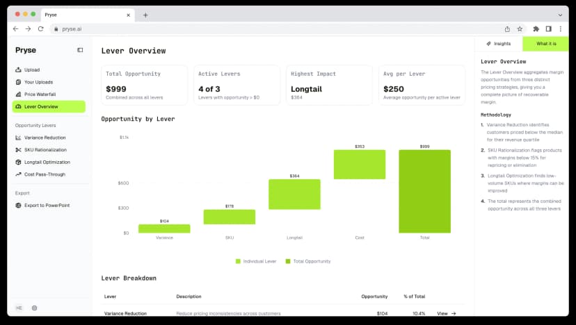
Step 1: Professional diagnostic. For $999/year, Pryse delivers the same analyses described above — customer margin ranking, product margin map, and price waterfall — at professional depth, with visualization and dollar-quantified recommendations. It's the same analysis done faster and deeper.
Step 2: Mid-market tools. If the diagnostic reveals $100K+ in ongoing margin opportunity that requires continuous monitoring, platforms in the $20K-$100K/year range automate what you've been doing manually.
Step 3: Enterprise platforms. If you have 20,000+ SKUs and a dedicated pricing team, enterprise tools (PROS, Vendavo, Pricefx) deliver AI-driven optimization. But this is a year-two or year-three step, not where you start.
For more on matching tools to your complexity, see our best pricing software guide. For a broader pricing improvement framework, see our pricing optimization guide.
Last updated: March 12, 2026
Frequently Asked Questions
Want to analyze your entire product catalog?
Pryse automatically identifies margin leakage across thousands of SKUs. Upload your data and find hidden profit in 24 hours.
$999/year. Cancel anytime.